How to Make Duotone Images Online Free
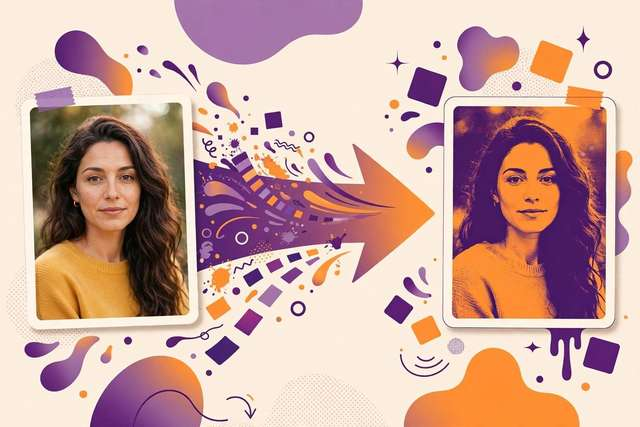
A duotone image turns an ordinary photo into a piece of graphic art: the full-color picture is rebuilt using just two tones, so shadows and highlights melt into one bold, cohesive color scheme. You’ve seen the look everywhere — concert posters, magazine covers, Spotify playlist art, and brand campaigns all lean on duotone for that instant designer feel.
The good news is you don’t need Photoshop or any design skill. With our free duotone maker, you can convert any photo into a duotone image right in your browser in under a minute — the file never leaves your device, and there is no signup or cost, ever.
What a duotone actually does
A duotone takes the grayscale version of your photo and maps the darkest pixels to one color and the lightest pixels to another, blending smoothly between the two. Black areas become the dark tone, white areas become the light tone, and every midtone lands somewhere on the spectrum between them.
This is why portraits work so well: faces have clear shadows and highlights, so the two colors separate beautifully. It is also why duotone is a favorite for branding — pick your brand’s two colors, run every photo through the duotone filter, and your entire Instagram feed suddenly looks designed instead of random.
How to make a duotone image online (step by step)
1. Upload your photo. Open the duotone maker and drag in your image, or click to browse. JPG, PNG, and WebP all work. A sharp, well-lit photo with good contrast gives the best results.
2. Pick your two colors. Choose from one-tap preset palettes (classic pairs like navy + orange, purple + yellow, or monochrome black + white) or use the color pickers to dial in your exact brand colors.
3. Fine-tune the look. Adjust the tone balance to shift which parts of the image lean toward the dark or light color. A slight shift toward the dark tone usually adds drama; toward the light tone feels airier.
4. Download and use. Hit download and save the duotone image as a PNG or JPG. Use it for social posts, thumbnails, posters, website headers, or print — there is no watermark on the output.
Where duotone images shine
Social media branding. A consistent duotone across your posts creates a recognizable feed style. Many creators duotone their thumbnails so new videos are instantly recognizable.
Event and gig posters. Duotone portraits of performers over bold backgrounds are the classic concert-poster formula, and they read well from a distance.
Website design. Duotone hero images tie photography into a brand’s color palette instead of clashing with it — a favorite trick of modern landing pages.
Merchandise and print. T-shirt and poster printers charge per color. A duotone design looks premium but keeps print costs low.
Tips for better duotone results
Start with contrast. A flat, gray photo produces a muddy duotone; bump the contrast first or pick a punchy photo. Portraits with strong side-lighting are the safest bet.
Match the mood to the colors. Dark, moody pairs (deep blue + black, plum + charcoal) suit music, fashion, and editorial work. Bright pairs (coral + yellow, teal + white) suit lifestyle, fitness, and kids’ content.
Test at thumbnail size. Most duotone images are viewed small — on phone feeds and video thumbnails. Check that the two colors still separate clearly when the image is tiny.
Duotone vs. other photo effects
Duotone is often confused with a few lookalikes — here’s how they differ and when to pick each:
Duotone vs. black and white. Black and white uses the full gray spectrum; duotone replaces it with two hues. Duotone feels warmer and more designed, while B&W feels documentary and timeless.
Duotone vs. color grading. Grading shifts the colors of a full-color photo; duotone removes color variety entirely. Use grading for photography, duotone for graphic design.
Duotone vs. posterize. Posterize reduces an image to flat bands of color — it looks illustrative and chunky. Duotone keeps smooth gradients, so it looks photographic while still stylized. For portraits and hero images, duotone almost always wins.
Common duotone mistakes
Picking two similar tones. Duotone needs contrast — navy and dark blue merge into mud. If your pair looks flat, push the light tone brighter or the dark tone darker.
Using a low-resolution source. Duotone can’t hide pixelation; it can actually emphasize it. Start with the highest-resolution original you have.
Ignoring the background. Busy backgrounds fight the duotone effect. Photos with clean, simple backgrounds produce the boldest, most poster-like results.
Frequently asked questions
What is a duotone image?
A duotone image is a photo recreated using only two colors — a dark tone for the shadows and a light tone for the highlights. It gives images a bold, unified artistic look used on posters, album art, and brand graphics.
Is there a free duotone maker online?
Yes — our duotone maker at /tools/image-duotone-maker/ is completely free and unlimited. Upload a photo, pick two colors, and download the result. No signup, no watermark, no cost.
Do I need Photoshop to make a duotone image?
No. Browser-based duotone tools produce the same effect for photos in seconds, with no software to install and no design experience needed.
What colors work best for duotone photos?
High-contrast pairs with a deep dark tone and a vivid light tone: navy + orange, purple + yellow, or teal + coral. Pick pairs that match the mood of your content and your brand colors.
Keep reading
How to Create a Favicon From Text or Emoji Online Free
Create a favicon from text or emoji online free. Make a custom browser tab icon in seconds — type a letter or emoji, pick colors, download.
Read more →
BMP vs PNG: Which Image Format Should You Use?
BMP vs PNG compared: file size, quality, transparency, and browser support. Learn which format fits your project — and convert between them free.
Read more →
Free Gradient Maker Online: Design Beautiful CSS Gradients in 2026
Design smooth CSS gradients online free — linear, radial, and mesh styles with live preview, color-stop controls, and copy-paste CSS code.
Read more →