Free Gradient Maker Online: Design Beautiful CSS Gradients in 2026
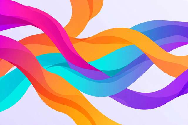
Gradients never really left — they just grew up. The harsh rainbow backgrounds of the 2010s gave way to the subtle mesh and duotone gradients you see across modern landing pages, app buttons, and hero sections. And the best part: you can design and ship production-ready gradients entirely in your browser, free.
A good gradient maker is less about the output format and more about the feel — live preview, fine control over color stops, and clean CSS you can paste without editing. This guide covers how to design gradients that look expensive, which gradient types to use where, and how to avoid the banding and muddiness that give amateur gradients away.
The three gradient types you actually need
Modern CSS gives you a handful of gradient functions, but three cover almost every design job:
- Linear gradients — color flows along a straight axis. Use for page backgrounds, buttons, cards, and text highlights. Angles matter: diagonal (135deg) feels dynamic; vertical feels calm.
- Radial gradients — color radiates from a center point. Use for glows, spotlights, vignettes, and avatar backgrounds. Position the center off-axis for a more natural light source.
- Mesh-style gradients — not a CSS primitive, but you can approximate them by layering two or three blurred radial gradients. This is the soft, organic look behind so many 2026 hero sections.
Start with linear for utility (buttons, bars, backgrounds) and radial for atmosphere (glows, depth). Mesh is the finishing touch for hero areas.
Designing a gradient in 5 steps
- Pick a mood, not just colors — a calm fintech blue-to-teal, an energetic coral-to-amber, a premium charcoal-to-grape. Grab two colors that already look good side by side.
- Open a free gradient maker — DollarWise’s free Gradient Maker gives you live preview, color-stop editing, angle control, and copy-paste CSS.
- Add a third stop for richness — two-stop gradients can look flat. A slightly brighter midpoint color (or the same hue with a nudge in lightness) adds depth without muddiness.
- Tune position and angle — drag stops to control where each color peaks. A 135-degree diagonal over a full-bleed hero looks modern; a vertical fade suits content backgrounds.
- Copy the CSS — paste the generated
linear-gradient()orradial-gradient()declaration into your stylesheet. Done — no images, no extra requests.
Because gradients are pure CSS, they scale to any screen, cost zero bandwidth, and animate smoothly.
Color rules that make gradients look professional
- Stay in a hue neighborhood. Colors adjacent on the color wheel (blue → teal → green, or rose → coral → amber) blend smoothly. Colors opposite each other fight and turn muddy gray in the middle.
- Mind the lightness jump. A jump from dark navy to near-white creates harsh banding. Bridge it with a mid-tone stop.
- Test on the real background. A gradient that glows on a dark editor can look washed out on your actual page. Preview against the final backdrop and final text color.
- Check text contrast. Gradients behind text are fine — as long as every point under the text passes contrast. Overlay a translucent dark or light layer when in doubt.
A handy shortcut: sample palettes from photos you like. A sunset photo often contains a perfect three-stop gradient — eyedropper the deep, mid, and bright tones.
Fixing banding and muddiness
Banding — visible stripes where colors transition — is the number one amateur tell. It happens when two distant colors stretch across a long distance with only 8-bit color channels to work with. Fixes:
- Add an intermediate color stop between the two extremes.
- Shorten the transition (make the gradient’s span smaller).
- Avoid pairing colors with wildly different lightness.
Muddiness is the gray sludge in the middle of two-stop gradients between distant hues (classic: blue → orange). The fix is a midpoint stop biased toward one of the endpoint hues — let the gradient pass through a richer intermediate instead of the dull average.
Gradient text and buttons: two high-impact uses
Two places where gradients punch far above their weight:
Gradient text — headlines with a color-shifting fill look premium and cost nothing. The technique is one CSS rule: set the text color to transparent and clip the background to the text (background-clip: text). Keep the gradient subtle (two close hues) so the headline stays readable, and always provide a solid-color fallback for older browsers.
Gradient buttons — a button with a diagonal two-stop gradient and a slightly darker gradient on hover feels tactile and modern. The trick is restraint: the two stops should be close in hue, differing mainly in lightness. Neon rainbow buttons scream 2012; a deep indigo-to-violet button whispers 2026.
Both techniques reuse the same gradients you design in the maker — copy the CSS once, apply it to backgrounds, text, buttons, and borders across the whole site for a coherent visual identity.
Frequently asked questions
How do I create a CSS gradient for free?
Use a free online gradient maker: pick your colors and angle, preview the result live, then copy the generated CSS. Tools like our free gradient maker output clean linear-gradient() code you can paste straight into your stylesheet.
What is the difference between linear and radial gradients?
Linear gradients blend colors along a straight line (top to bottom, left to right, or at an angle). Radial gradients blend outward from a center point in a circle or ellipse. Linear gradients suit backgrounds and buttons; radial gradients suit glows and vignettes.
How many color stops should a gradient have?
Two or three is the sweet spot for most designs — more stops add complexity and can look muddy. Use mid-point stops to control exactly where each color peaks.
Why does my gradient look banded instead of smooth?
Banding appears when two colors are too far apart on a limited color range. Fix it by adding an intermediate color stop, shortening the transition distance, or choosing colors with closer lightness values.
Keep reading
YouTube Banner Size 2026: Dimensions and Free Resizer
The exact YouTube banner dimensions for 2026 — full size, safe area, and device crops — plus how to resize a banner and design tips that work everywhere.
Read more →
Lorem Ipsum: What It Is and How Designers Actually Use It
What is lorem ipsum, where it came from, and why designers still use placeholder text. Plus how to generate it free in seconds.
Read more →
Acronym Generator Online Free: Turn Any Phrase Into an Acronym
Generate acronyms from any phrase online free — how acronym generators work, naming tips for projects and businesses, and a free tool.
Read more →